Overview
Concept : An app to help you prepare you for interviews
Client: Student Project at CareerFoundry
Platform: iOS & Android Mobile
Duration: 1 month
Role: Visual Direction | Visual Designer | Illustrator | UI Designer | UX Designer | Project Lead
Methods: Project Proposal | Define Objective | Context | Research Users | Requirements | Key Features | Screen Designs based on Material Guidelines & IOS Guidelines | User Testing | Feedback | Iterations
Skills: Illustration | User Research | User Personas | User Flows | Rapid Wireframes | Low Fidelity Wireframes | High Fidelity Wireframes | Mockups | Prototype | Mockups
Tools: Sketch, Invision, Adobe Photoshop, Adobe Illustrator, Omnigraffle, Balsamiq
Problem
Interviews often gives us anxiety, there are lot of questions that come to our mind before appearing for an interview. Not all students have access to campus interviews or college programs or those who are looking for a career change. This app will help individuals or students who need expert help to prepare for professional interviews,
Context
This app was a part of my UI design course. The task was to create a mobile app for iOS and Android device. The aim was to dive deeper into studying the respective design guidelines and to create two different prototypes for the each platform.
I decided to name the app “PrepTalk” which breaks down into two words - Preparation + PepTalk = PrepTalk
Process
Discover
1) Vision/Goals
The goal is to create a platform where users can interact with the experts in their respective field. So for starters I researched who would be the potential users and further narrowed down my end users in below categories:
• Students • Self Starters • Professionals • Graduates • Individuals looking for a career change
2) Market Research
I conducted a market research to study few competitors and what they offer. Glassdoor: Users can interview reviews, Q & A, check job postings and salary. Wordzen: This app helps to ensure your emails are polished before you apply for certain job vacancies. Pramp: Allows you to practice technical interview for free. Job interview questions and answers: You can practice tough Q&A with mock interviews.
Synopsis: While all these apps offered some good features they focus on one or other area. This conclusion helped me to determine some important points for this app-
a) Users should get a one on one experience by industry experts.
b) Users should be able to select the industry they are interested in exploring in order to get more accurate search results and respective help and guidance.
c) Users can select the level of education.
3) User Research and Requirements:
Surveys - After determining who your end/target users are, it’s crucial to understand their needs and wants and what they expect from the product or app. So in order to do that I adopted a method of crowd sourcing where I used Facebook and Whtsapp to conduct a survey on 20-25 people.
Interviews - User interviews is another crucial step to understand your users, their pain points, frustrations, motivations and expectations. So I conducted user interviews on 3 potential users from different backgrounds, education levels and professions. Here are some questions and answers from that session:
User Requirements: It was very clear from the above data that there are lot of people who are thinking of a big career move or just exploring opportunities, but have to search for this information from different places so to have a place where these resources would be all available at one place would be a main focus for this app.
Define
1) User Personas
At this point I had researched almost 30 people through surveys and interviews based on different career goals, geographical locations, age group, backgrounds and education. Keeping in mind their frustrations and needs I developed 3 user personas representing different groups. I used quotes from my user interviews to depict different perspective.
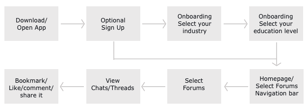
User Scenario 1 - Emma wants to grow her professional network and would like to connect to people in similar situation as her where she can find discussion threads, question and answers etc.
Tasks - Open/Download app - Optional sign up - Onboarding - Home screen - Navigation - Select Forums
User Flow -
User Scenario 2 - Anthony wants to get his resume evaluated
Tasks - Open/Download app - Optional sign up - Onboarding - Home screen - Pre-Interview - Resume - Options
User Flow -
User Scenario 3 - Bethany wants to listen and download regular podcasts on changing trends in job market
Tasks - Open/Download app - Sign in/Sign up - Onboarding - Home screen - Pre-Interview - Resume - Options
User Flow -
2) Key Features:
At this point I had a good understanding of my user needs and what they would expect from this app. So I pinned down these key features.
Ideate
1) Sitemap:
Once I had an idea what key features to focus in this app and had a clear and concise picture of different user scenarios and user personas, the next step was to figure out the navigation flow, what and how users would complete each task if the flow makes sense. So I combined the above user flows to create a sitemap.
2) Wireframes:
a) Low Fidelity Wireframes- Now that sitemap was complete and the navigation flow was in place, the next step was start building the app. Wireframes act as a foundation of your product so it’s crucial at this point …I created iOS and Android version for each screen adhering to respective guidelines. I used Balsamiq app for these. For this task we were asked to annotate these pointing out the differences in design and features.
Ideate
b) Mid Fidelity Wireframes:
I created mid fidelity wireframes in Sketch. Below is a snapshot of few explaining the UI patterns used and state of screens used.
Prototype
1) Patterns and Sounds:
Next step was to study different patterns and sounds as per iOS and Material guidelines. For example tap sound and vibrate for Android version and selection sound for iOS.
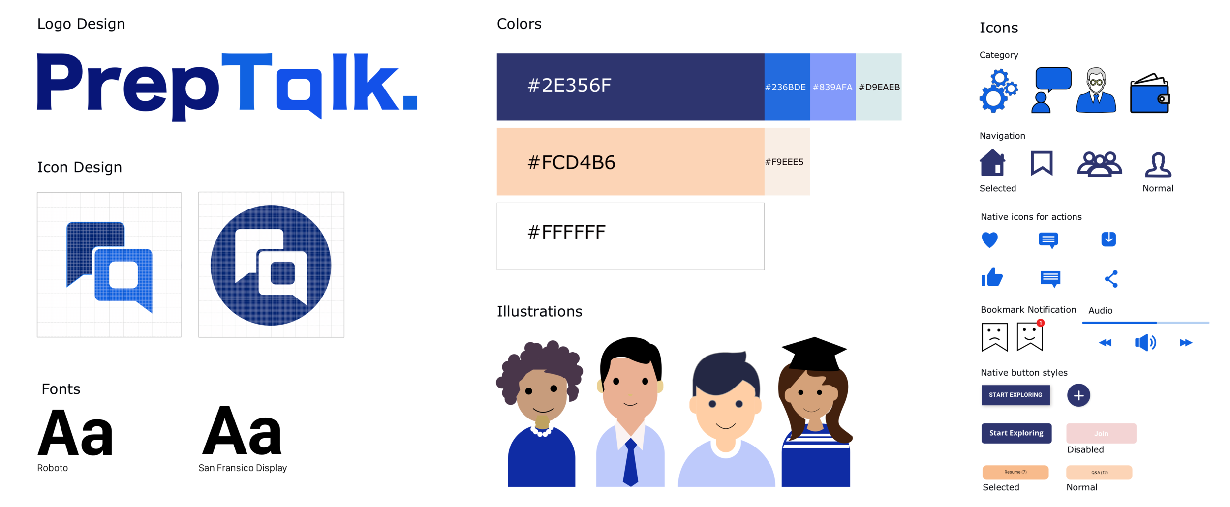
2) Style Guide:
PrepTalk is an informative and interactive app so deciding the visual direction for this project I wanted to keep it light, fun and vibrant. So I used light orange color, white and different hues of blue. For images I created all the illustrations using pen and paper and then in Adobe Illustrator.
Visual Design
I then applied the style guide to my iOS and Android mid fi wireframes and created high fidelity wireframes using sketch.
User Flow
Below is a diagram of the iOS high fidelity screens explaining the user flow for all screens in this interview app.
Welcome Screen
Welcome screen will guide users about their options, existing users can sign in and new users can either sign up or browse the app.
Onboarding Screens
Onboarding screens for the new or guest users to give them an idea how the app works with illustrations created in Adobe Illustrator.
Onboarding Screens:
Onboarding screens for users to select their education and industry, so they would get a relatable feed every time they login. Below you can see iOS and Android screen design adhering to respective guidelines.
Home Screen:
Homepage design for iOS with search bar and cards with round corners as per the iOS guidelines and search icon on top right and flat cards for Android. Users can select from 6 main categories - Pre-Interview help, Post-Interview help, From Experts, Webinars, Current Trends and Interview Stories.
Bookmarks:
This feature will enable the users to bookmark their favorite posts, articles, videos etc.
Forum:
This feature provides a platform for the users to connect with other users. It’s divided into 2 sections Public and Private Chats.
Help from Experts:
Users can access materials such as interview preparation posts, audios, videos posted by the Experts. They can bookmark or share like these too.
Interview Stories:
This feature will allow users to share their own experiences as interview stories. They can share what they learned, any useful tips they might have regarding the specific role or company here.
Testing
1) User Testing:
I created two different prototypes in Invision, one for iOS and one Android and then conducted a user testing on 3 iphone users and 3 Android users. I asked them to walk through the app and comment on overall flow, design and features and then documented their feedback and made iterations in the final design based on that.
Retrospective
1) What went well?
Based on the feedback I received during user testing:
• Concept - Based on user feedback the concept was very well received
• Visual Design - I think the use of illustrations gave a light feel overall, even though subject is a bit serious
2) What can be improved?
• Features - I think I missed to add some crucial features like calendar, since this is an interactive app, if users would like to set up a time to chat with experts, there should have been a place where they could do that and keep a record of it.
• User flow for interviewers - My initial idea was to develop an app where users can sign up as ‘Interviewees’ and experts can sign up as ‘interviewers’ but due to time constraint that didn’t go as planned.
3) Plans for future:
For the future Iteration of this project I am going to create some more user flows & user personas for interviewers section. I am also going to incorporate calendar feature in the app.


